Devlog 3: Finished Prototype
Art
Sinds last week we invested a lot of time into finishing up our art bible, we're excited to show you what we have in store! As you may remember from last weeks the sheets looked a little... well gray and boring. So we set on fixing that too and gave it all a nice layout so we can proudly show off what we have in mind for the games aesthetics.
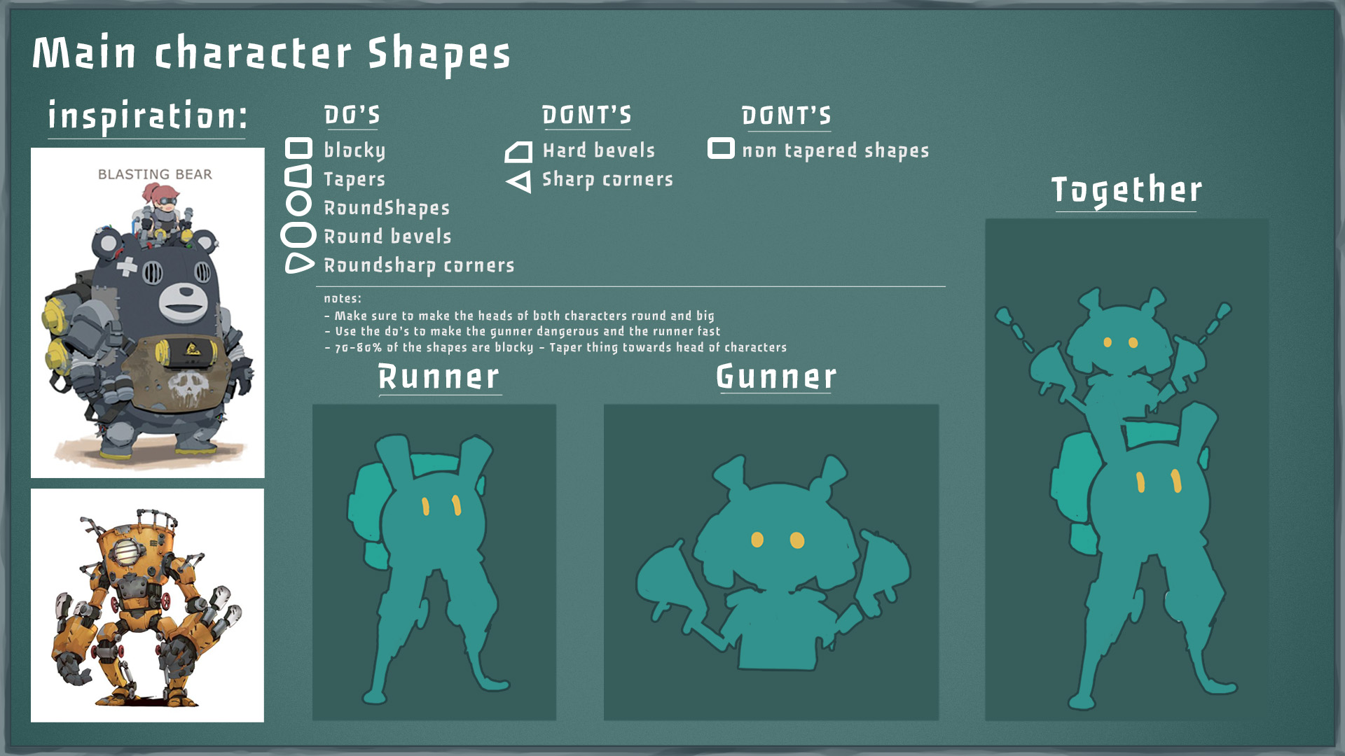
Let's start of with Peggy and Leggy, we established the shape language for them to set them apart from the background shapes. The background shapes will be mostly blocky but you'll read more about that later.
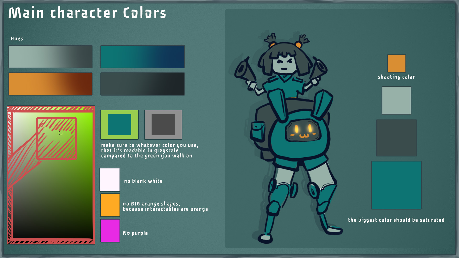
As well as het color scheme, we tried to find a nice balance of color that would also set her apart from the backgrounds. we're reserving orange for mostly the UI, RFX and small details.
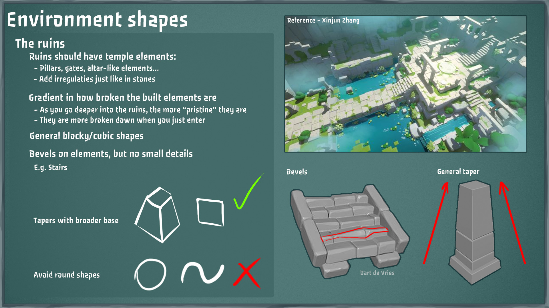
The ruines we'll be exploring during our game are made of of blocky shapes and have numerious challanges for Peggy and Leggy to overcome together. As stated before we're exclusively going to use squares and straight edges for the enviroment. We're really inspired by the art of Xinjun Zhang and we'd love to incorperate this style for the enviroment.
The enviroment colors also take from this inspiration. However we adjusted it to what would look good in our lighting conditions. 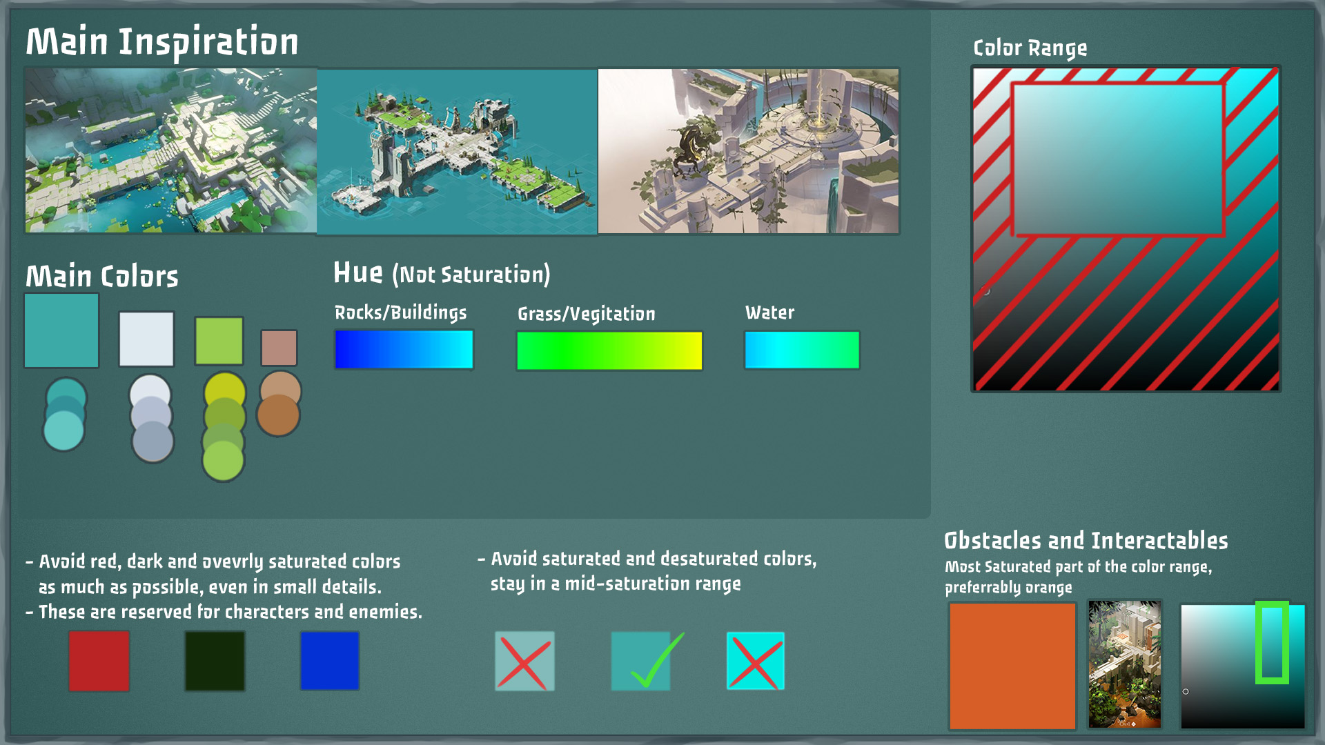
But some of the challanges you'll face our our little robotic minions or also known as the wall of impending doom. These adorable little guys don't take to kindly to intruders, but they can be outrun. we're giving them the same shape language characteristics as the enviroment to bind them to the location.
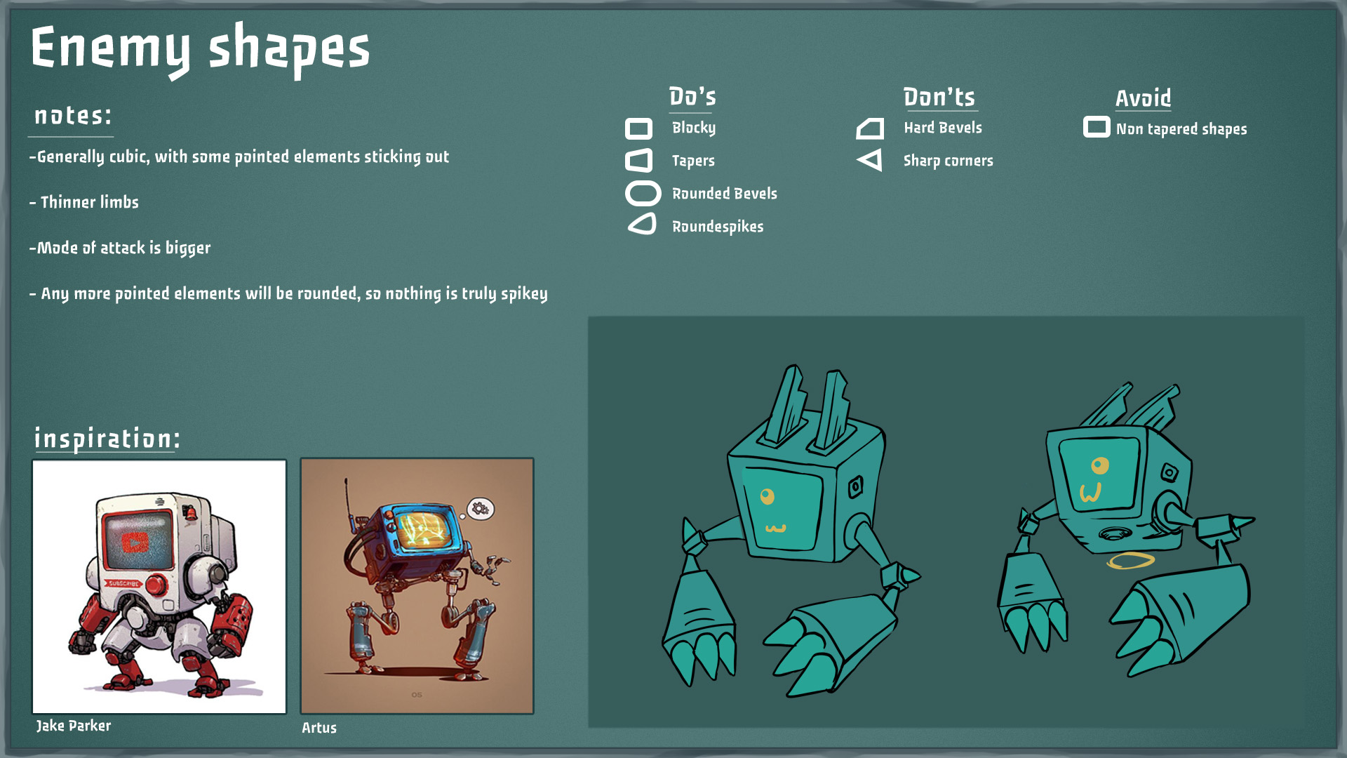
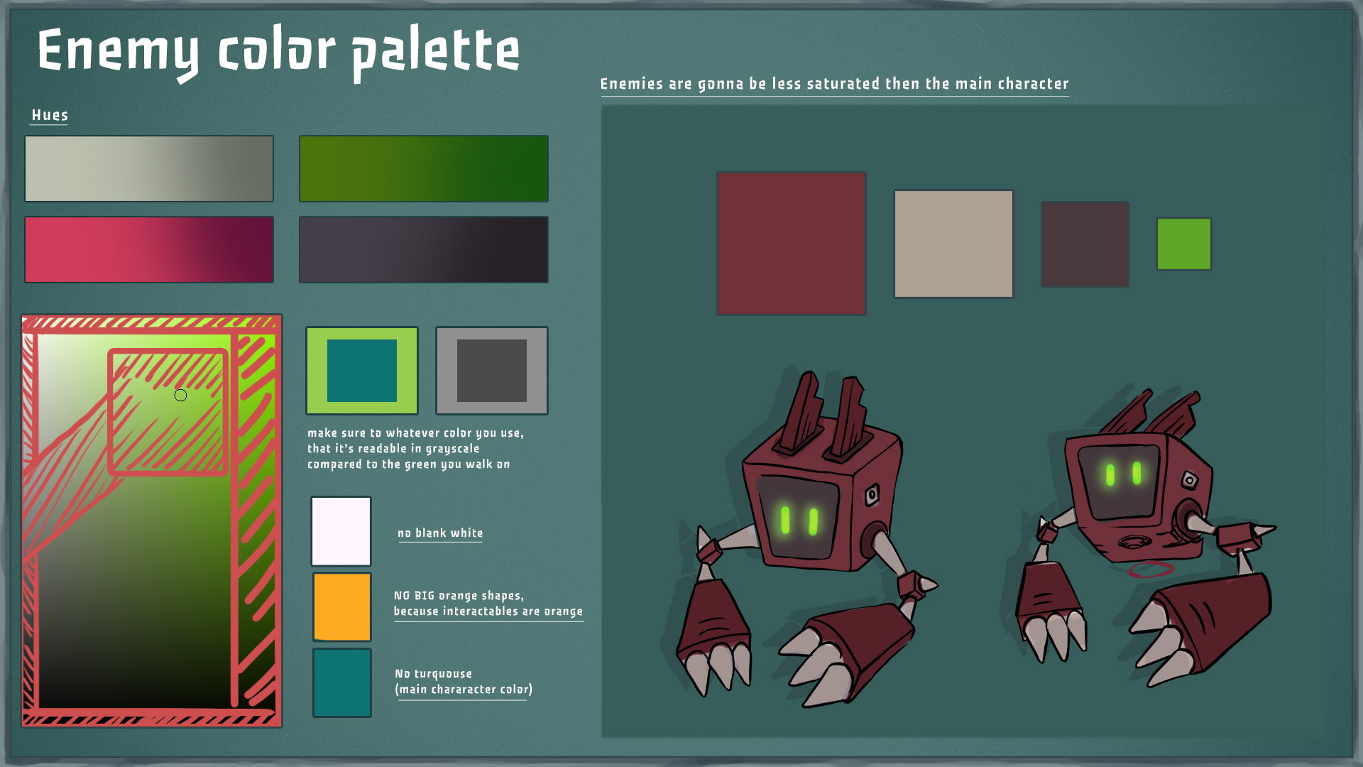
But making them grey or green would blend in to much so we're giving them a little stand out make over.
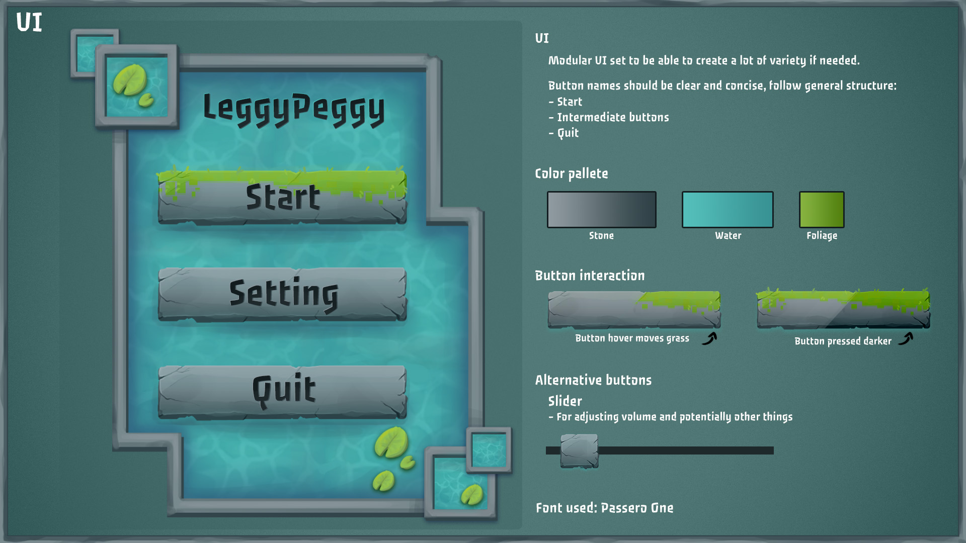
The UI hasn't changed much par from a few tweaks, but we have settled on a HUD design.
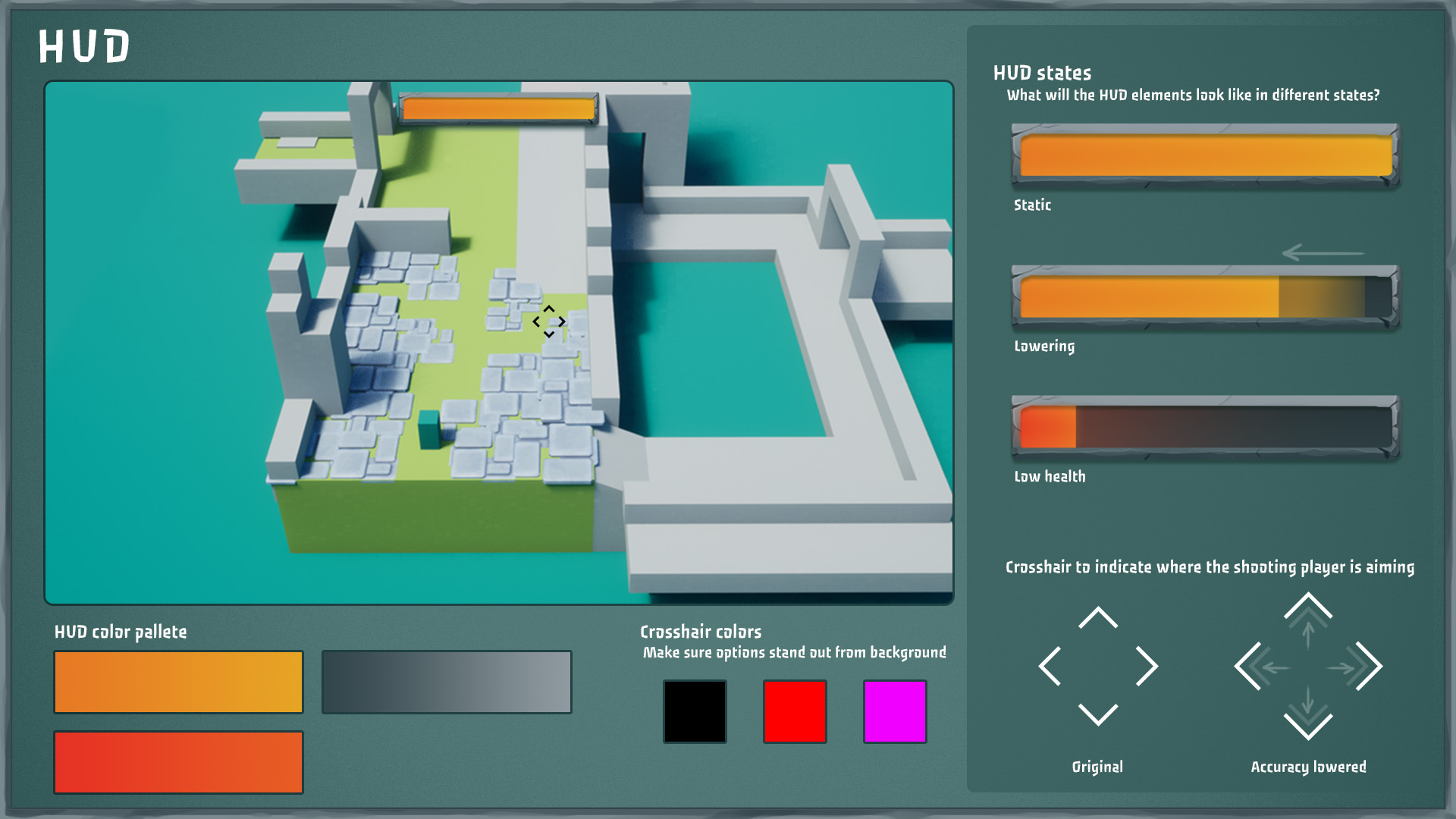
We want to make sure that the player health stands out a lot and that the crosshair communicates the instability influence to the gunner player. Because you've made it so far it also contains a treat of a little mockup level.
Coding
We expanded on our prototype from last week and addressed some of the feedback we got.
The shooter felt like a less important role compared to the mover.
It felt like you could complete the game with just movement alone, only the buttons that you had to shoot stopped you from doing that.
To make the runner more important, we added a new enemy type. This enemy always runs ahead of the player, so you can't outrun it. It also places down traps that you need to avoid. If the shooter doesn't kill this enemy, it is almost impossible for the mover to survive.
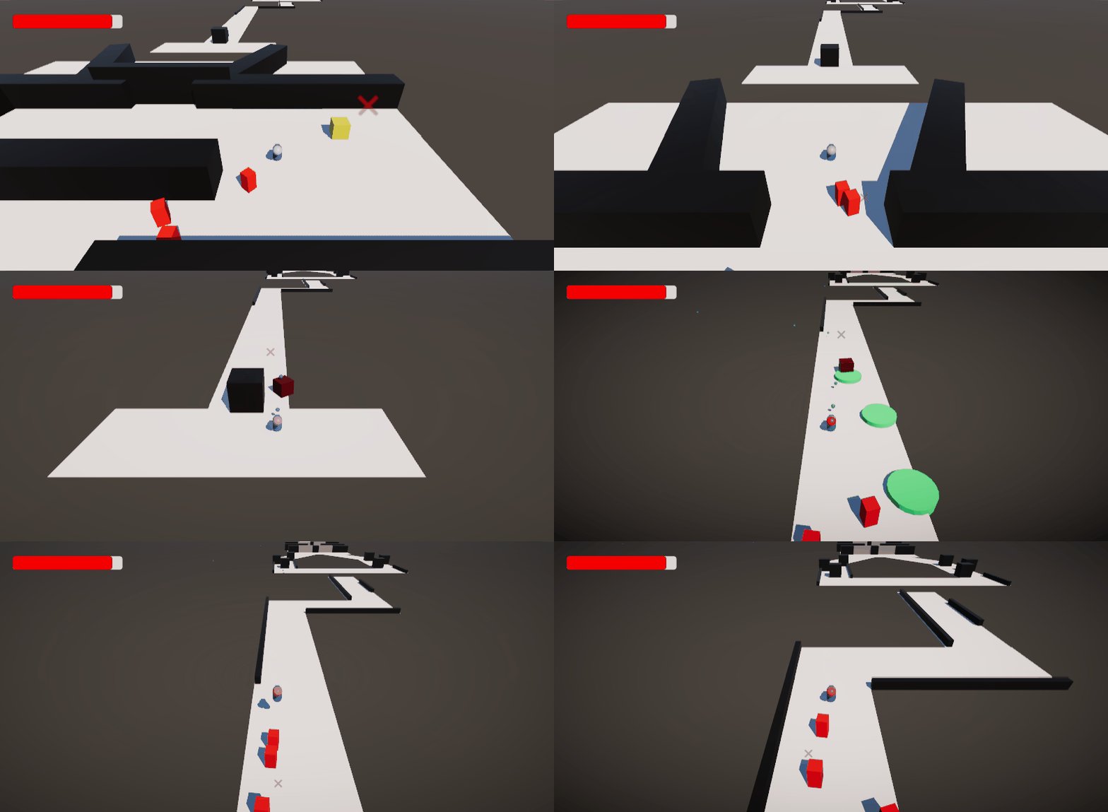
Another point of feedback was that it wasn't always clear when the shooter fell off.
We fixed this by adding a visual that represents the shooter on top of the mover.
It also was difficult to keep looking at the instability bars on the top left while you are playing, so we added a few visual cues that replace the bars completely.
When the shooting instability goes up and the accuracy decreases, the crosshair increases in size. This notifies the shooter. The mover gets notified by the character gradually changing color from blue to red. (this will be replaced by animations in our actual game).
When the moving instability goes up, there is a vignette effect that gets stronger the more the instability increases. The shooting player visual also turns red to notify the shooter.
We also changed the controller aiming to now directly aim in the direction the joystick is pointing.
This uses a raycast to detect if you're going to hit something, and then snaps the crosshair to that position.
After that we made two more levels to test out some level design.
We made a level which focuses on height differences, this makes the level feel more dynamic.
While making this level, we also added sliding. Which is a different way of breaking off the flow of the enemies, it's very similar to jumping over a ledge, but adds some variety. It's also a cool way to go downhill.
We also made a level which is much wider compared to the previous levels we made, this allows the players to have more of a choice of where they go. This is also another thing to communicate about, because maybe the shooter is already shooting to open a gate on the left, while the mover was heading to the right. Players will really need to communicate to make sure this doesn't happen.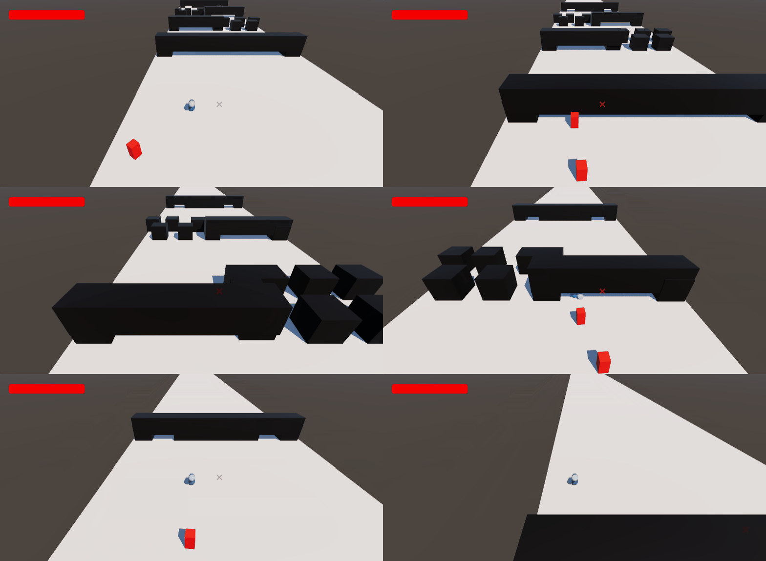
You can test out the different levels in the build by pressing the number keys.
Game Controls
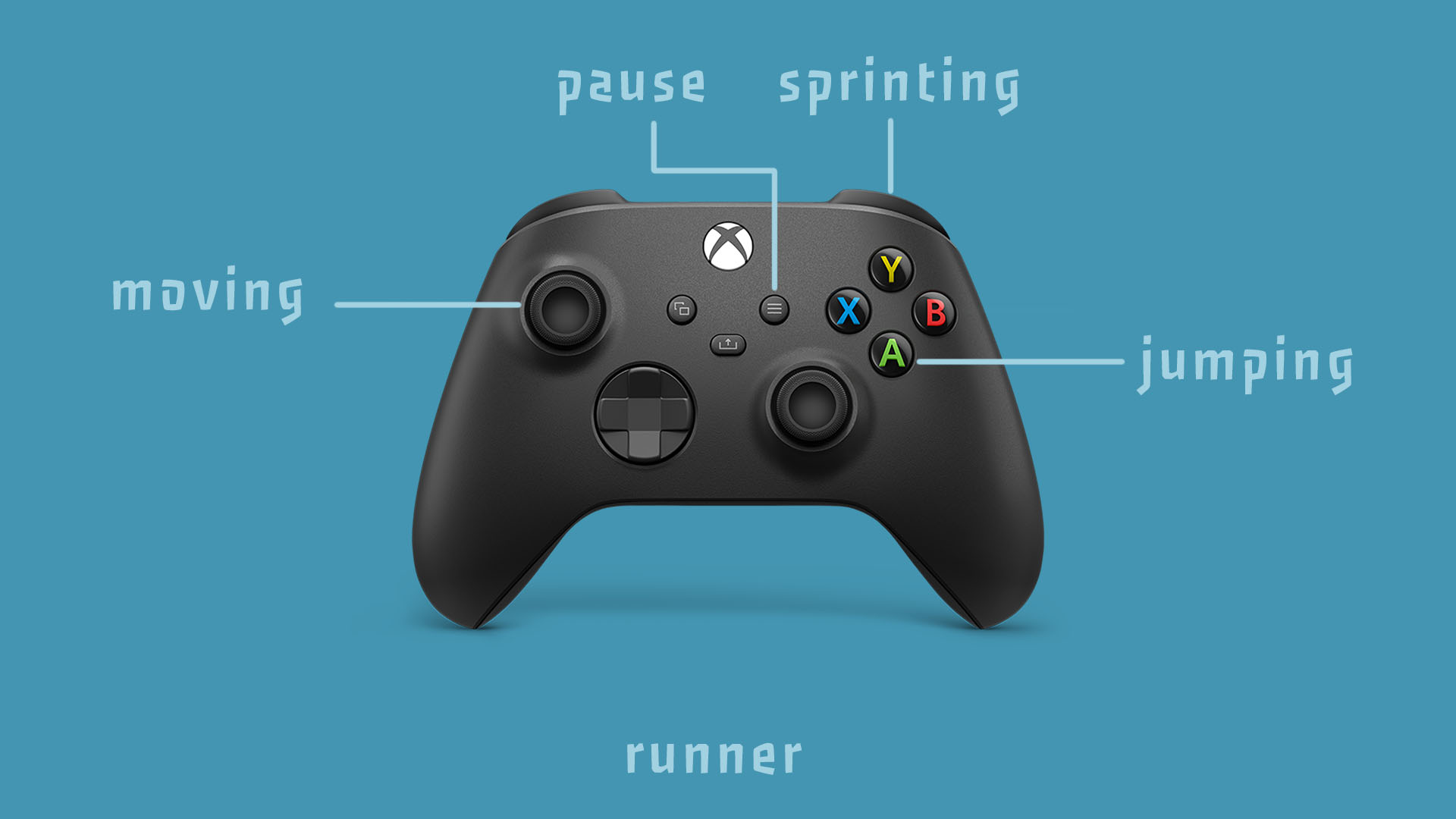
From this devlog on, we'll be adding the controls for our game, and update it weekly to showcase changes.

Files
Get LeggyPeggy
LeggyPeggy
Grab a friend and fight your way to the end - Let's see what you're made of!
| Status | Released |
| Authors | Rune, Sarah Platteau, hugo.colauto, LukevanKlooster, simon5986, MalouDePaepe |
| Genre | Action, Adventure, Platformer, Shooter |
| Tags | 3D Platformer, Cute, dae, Local multiplayer, Third Person, Two Player |
| Languages | English |
More posts
- Devlog 11: Final weekMay 30, 2023
- Devlog 10: Start of PolishMay 23, 2023
- Devlog 9: Final week of productionMay 16, 2023
- Devlog 8: Second Production Part 2May 09, 2023
- Devlog 7: Second production sprintMay 02, 2023
- Devlog 6: End Of Sprint 1Apr 25, 2023
- Devlog 5: Production Part 2Apr 18, 2023
- Devlog 4: Production Part 1Mar 28, 2023
- Devlog 2: PrototypingMar 14, 2023
Leave a comment
Log in with itch.io to leave a comment.